The Data Mining tool lets you create your own SQL queries against your event data, user metrics or aggregated measure data then visualise the results and create custom dashboards. This lets you create more complex queries than would be possible in Slice & Dice without needing to connect a third party SQL tool through Direct Access. It is suited to running quick ad hoc queries against your data.
Data Structure
 Event data is held in a single wide table that is optimized for rapid queries. Each event is allocated a single row in the table, complex events like transactions that can contain arrays of items and currencies will be allocated multiple rows. The event table is updated with new events as they arrive at regular intervals, currently the update cadence is 1-2 hours.
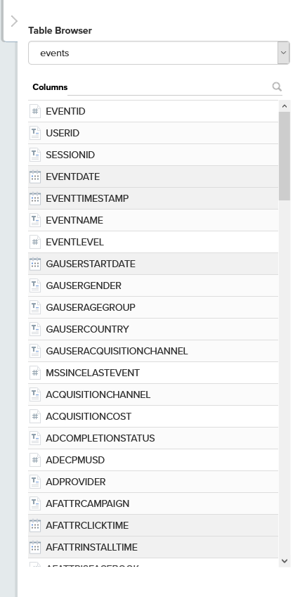
Columns in the database are uniquely named based on the event structure, as you extend or update your events the event table will gain additional columns for any new parameters added.
Each event has a unique eventID that identifies it. The mainEventID, parentEventID and eventLevel parameters can be useful when querying complex events that contain arrays of product items and currencies.
User Metrics data is also queryable in the Data Mining tool. The user_metrics table contains a single row of data for each player in your game. The columns in the table represent each user metric field. There are three types of user metric that you can access with the data mining tool:
- Generic Metrics: These are user metrics that are calculated automatically for every game e.g. totalSessionsPlayed
- Event Count Metrics: There will be an event count metric for each event type that your game sends e.g. eventLevelUpCount
- Parameter Metrics: There can be multiple metrics for any of the parameters that you send in your events. Some of these will be enabled by default, but you will need to check the relevant metrics checkboxes in your Game Parameters management screen if you wish a specific parameter to be used as a metric, or if you add a new parameter to your game. The metric options available depend on the parameter type
- String-based parameters can record the first and last value of a parameter. Useful for recording the first item a player purchases or the last mission they play. e.g. fieldMissionNameLast
- Numeric parameters can record the first and last values, but they can also record min, max, count and sum aggregates. So you can track things like maximum gold balance, sum of currency spent by the player, etc., e.g. fieldUserXPMax
The user_metrics table is updated every 3-4 hours. It contains a snapshot of the most recent player metrics for every player in your game, regardless of how long ago they last played.
Please note, the Engage platform does not use these user metrics snapshots when evaluating player segmentation criteria for in-app A/B tests and campaigns, it uses a version of user metrics that is up to the second accurate for all players currently playing the game.
The aggregated measure data which drives your Measure Charts is also queryable. The aggregated data is held in 6 fact tables containing daily, user level summaries for your entire game history.
- fact_user_sessions_day : contains aggregates for each player session
- fact_wau_users : contains weekly user counts
- fact_mau_users : contains monthly user counts
- fact_mission_users_day : contains details of missions played, completed, failed for each player, each day
- fact_product_users_day : contains product purchase information for each player, each day
- fact_event_type_users_day : contains counts of event types recorded for each player, each day
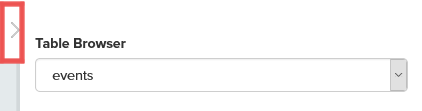
You don’t need to memorize all your event parameter or user metric field names, there is a legend at the right-hand side of the screen that contains lists of your event and user metric columns and their type. This legend can be minimized by clicking the small arrow icon at the top left of the legend.
Query Management
The toolbar at the top of the Data Mining page lets you give your queries a descriptive name and save them. You can also load previously saved queries, copy them, run them and export their results to a .csv file.

Building a Query
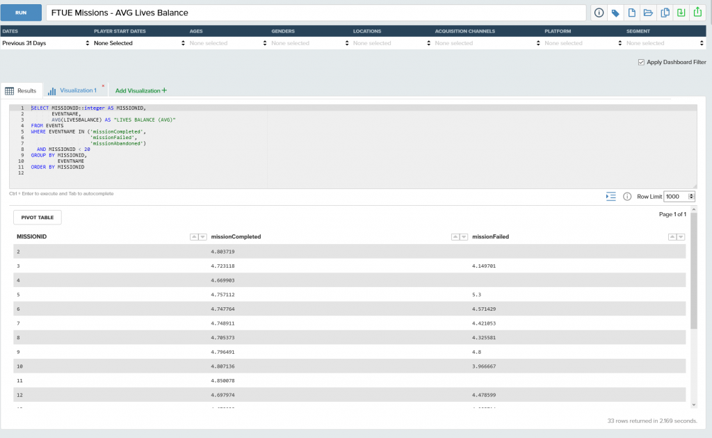
Type or paste your SQL in to the Query panel. The Vertica Analytics database that your data mining SQL queries are running on supports some excellent analytics functions. Please refer to the Snowflake SQL Function Reference Manual for further info.
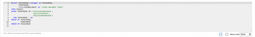
The data mining tool is intended for running quick ad hoc queries, it should not be used to try and download large data exports. If you need to download large exports please use your S3 data archive or direct access. There are query timeout constraints and limits on the number of rows that can be returned to prevent the data mining tool being used for large exports.
Tip: Be careful with
SELECT *
- It is always far more efficient to specify which columns you are interested in a column store like Snowflake rather than using SELECT * . If you specify the column names your queries will run much more quickly.
- Conversely, if you are counting columns, you should always use a COUNT(*) as this will let Snowflake to choose the best column to do the count
Visualizing the results
By default, your query will return a table of results, but you can also build visualizations of your queries and use them to populate custom dashboards.

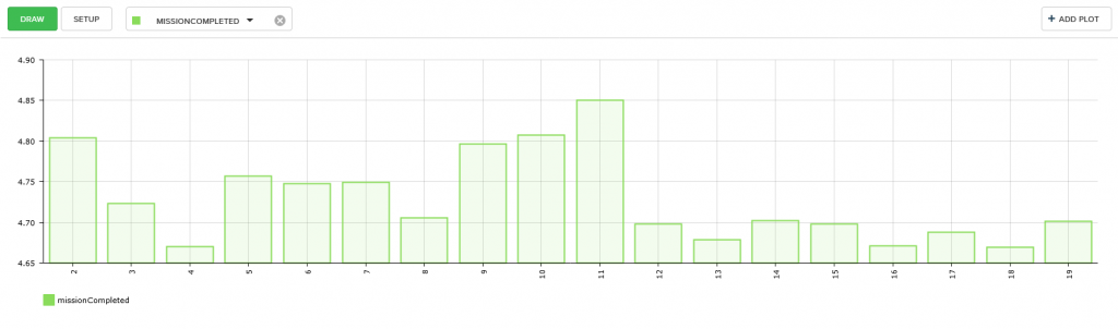
You can toggle between results table and visualization views by clicking the results or visualization tabs above the query box.
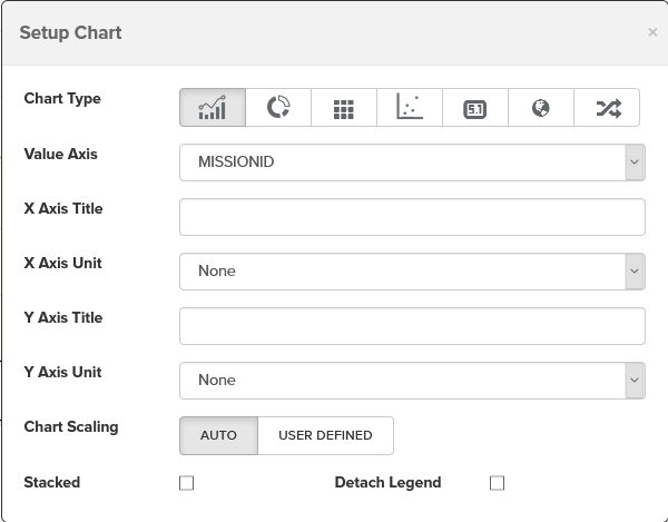
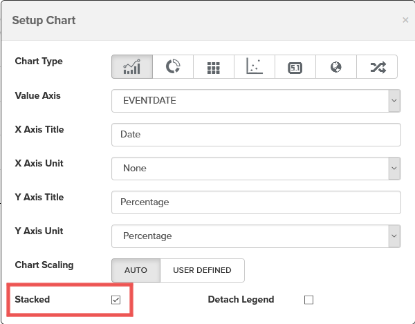
The SETUP button inside the visualization tab is used to choose the visualization type, define labels for the x and y axes of your chart, as well as selecting which data column should be displayed on the x axis. The scale of the y axis and whether it is stacked are also chosen here.
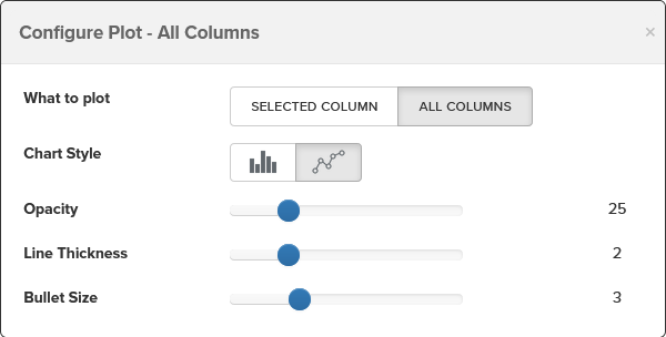
The ADD PLOT button is used to define each series of data to be displayed on your chart. You can display multiple stacked series by clicking the button multiple times, defining each of the series values and specifying the type of the series (Bar or Line) and other display options.
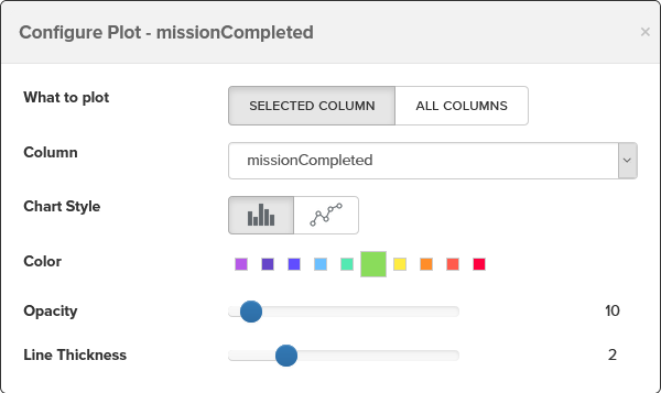
Click the DRAW button to re-draw your visualization using from your query results and visualization settings
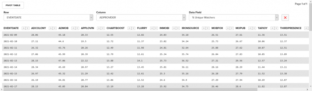
Pivoting your data
You can even summarize your data using the pivot table feature on the query results page.
Click the PIVOT TABLE button then select the row, column and data fields you wish to pivot on.
You can then build stacked chart visualizations by clicking the Stacked checkbox on the Chart Setup page then adding additional plots for each of the stacked groups or choosing the ALL COLUMNS option in the first plot.
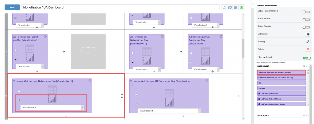
After saving your Data Mining query you can add it to a Custom Dashboard by dragging your query into one of the panels on the custom dashboard editor. Then you can choose whether the query will be displayed as a table or chart by selecting the appropriate option.